colours
Dark-first palette. Six named colours with five steps each: bg, border, default, light, muted.
base surfaces
--bg-base #161a16 page background --bg-subtle #1e261e sidebar, elevated surfaces --bg-elevated #111111 cards, code blocks named colours
cream — primary text
semantic mapping
| meaning | colour |
|---|---|
| active · success | Sage |
| informational | Fjord Teal |
| warning | Amber |
| error · destructive | Terracotta |
| decorative · highlight | Olive |
| disabled · muted | Fog |
typography
IBM Plex Mono — used at all levels. No secondary font. Four sizes: 24px, 18px, 14px, 11px.
type scale
weights
capitalisation
| element | case | example |
|---|---|---|
| nav, sidebar, tabs | all lowercase | foundations · components |
| headings (h1–h3) | all lowercase | colour palette |
| buttons | all lowercase | save changes · delete |
| badges, tags | all lowercase | active · warning · v1.2.0 |
| form labels | all lowercase | project name |
| notice titles | all lowercase | deployment successful |
| body / descriptions | Proper case | Dark-first palette with six colours. |
| notice body | Proper case | Your app is live on port 5801. |
| proper nouns | As written | IBM Plex Mono · Claude |
| ALL CAPS | not used | — |
spacing
3px base unit. Nine named steps. Default to generous: space-4 inside components, space-8 between sections.
badges
Dot + coloured border. Neutral cream label text. No filled background.
semantic variants
no-dot variant
forms
Underline style — bottom border only. No box, no background fill.
states
cards
Flat, border only. No shadow. Three variants: default, hover state, accent (left border).
variants
Border only, elevated background. Used for content grouping.
Border brightens on hover. No other visual change.
3px left border in sage. Used to highlight active or important content.
tables
Row borders, no fill. Header in eyebrow style. Numeric columns use tabular figures.
| name | port | status | updated |
|---|---|---|---|
| wc2026-app | 5801 | active | 2026-04-07 |
| euro26-app | 5802 | active | 2026-04-06 |
| ds | 5803 | building | 2026-04-08 |
| request-app | 5804 | disabled | 2026-03-12 |
notices
Left border strip. 3px left border in colour-default, 1px remaining sides in colour-border. No background fill.
code
Line numbers. Gruvbox-inspired syntax tokens mapped to the palette. Inline code in olive.
block
const palette  = {
  sage:  '#5a9060',  // active · success
  amber: '#a07830',  // warning
  terra: '#963830',  // error
};

function getToken(name: string) {
  return palette[name] ?? null;
}
inline code
Use --sage-default for interactive elements. Never use --sage-bg for text colour.
syntax tokens
| type | colour | palette |
|---|---|---|
| keyword | #c99a40 | Amber |
| string | #9aae50 | Olive |
| function | #78b880 | Sage |
| type | #5d9e8a | Fjord Teal |
| number | #b85248 | Terracotta |
| punctuation | #5a6a62 | Fog |
| comment | #4a5a45 | dark muted |
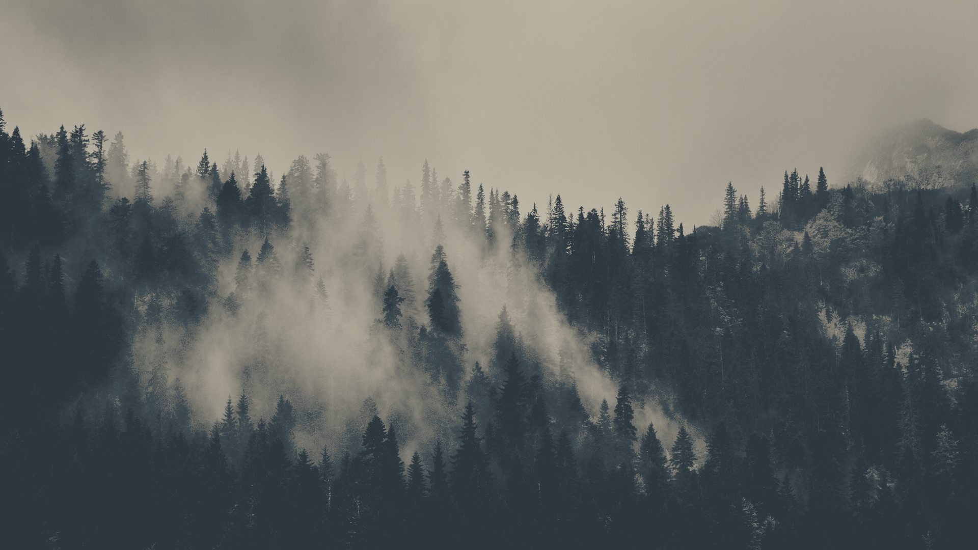
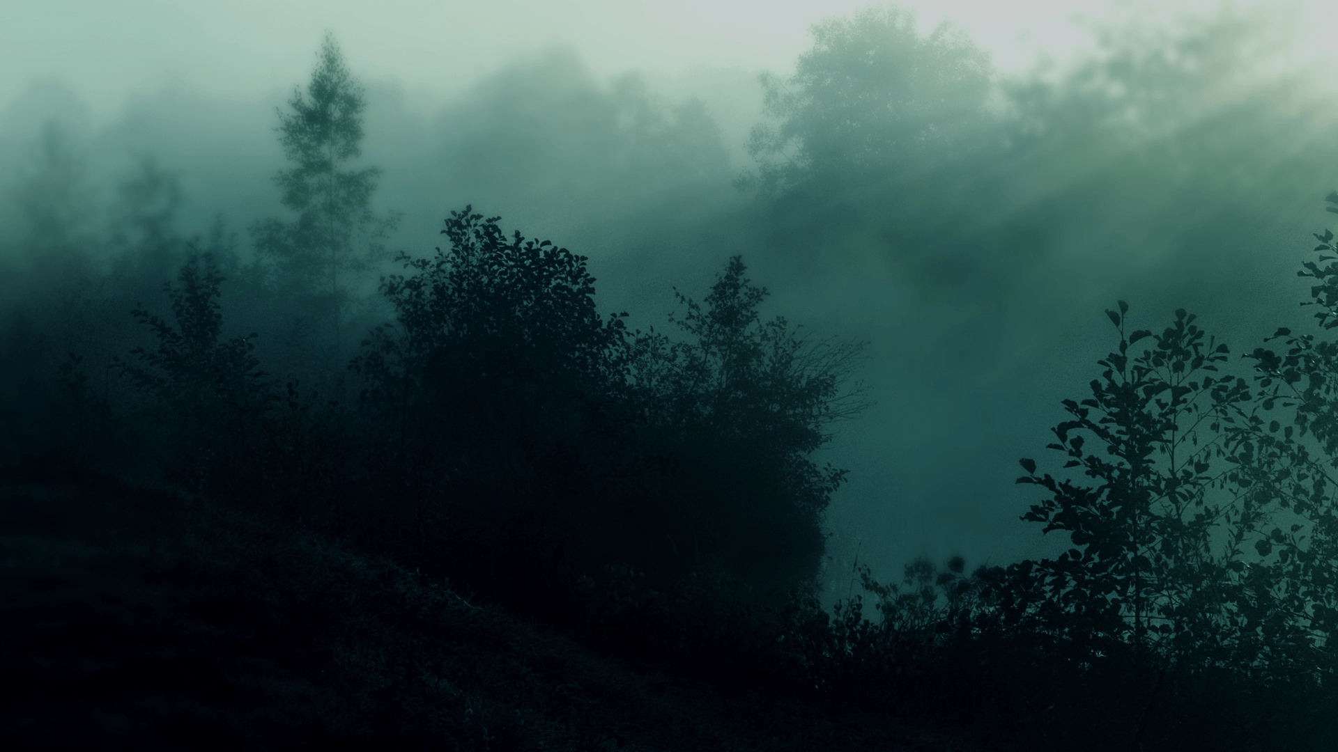
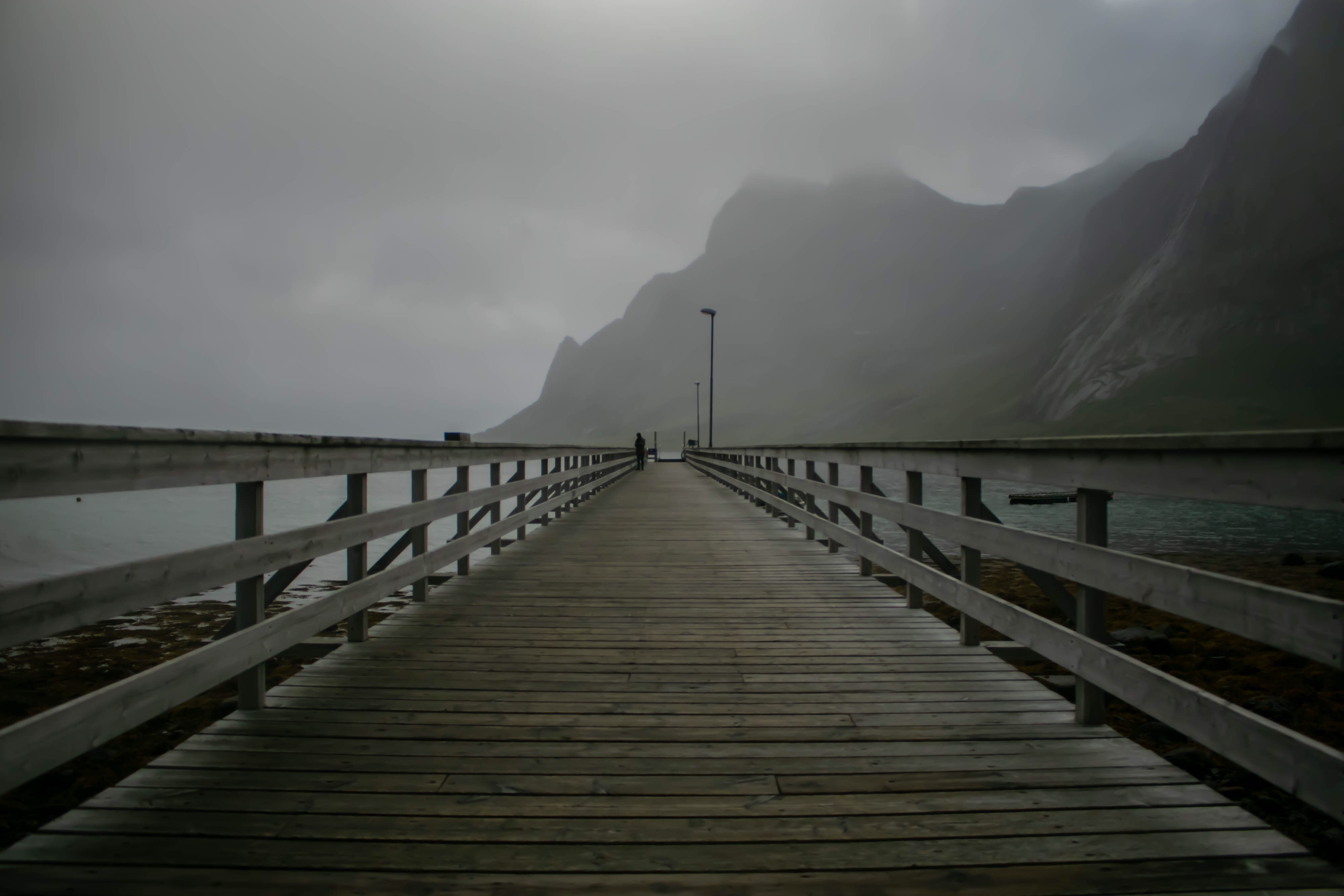
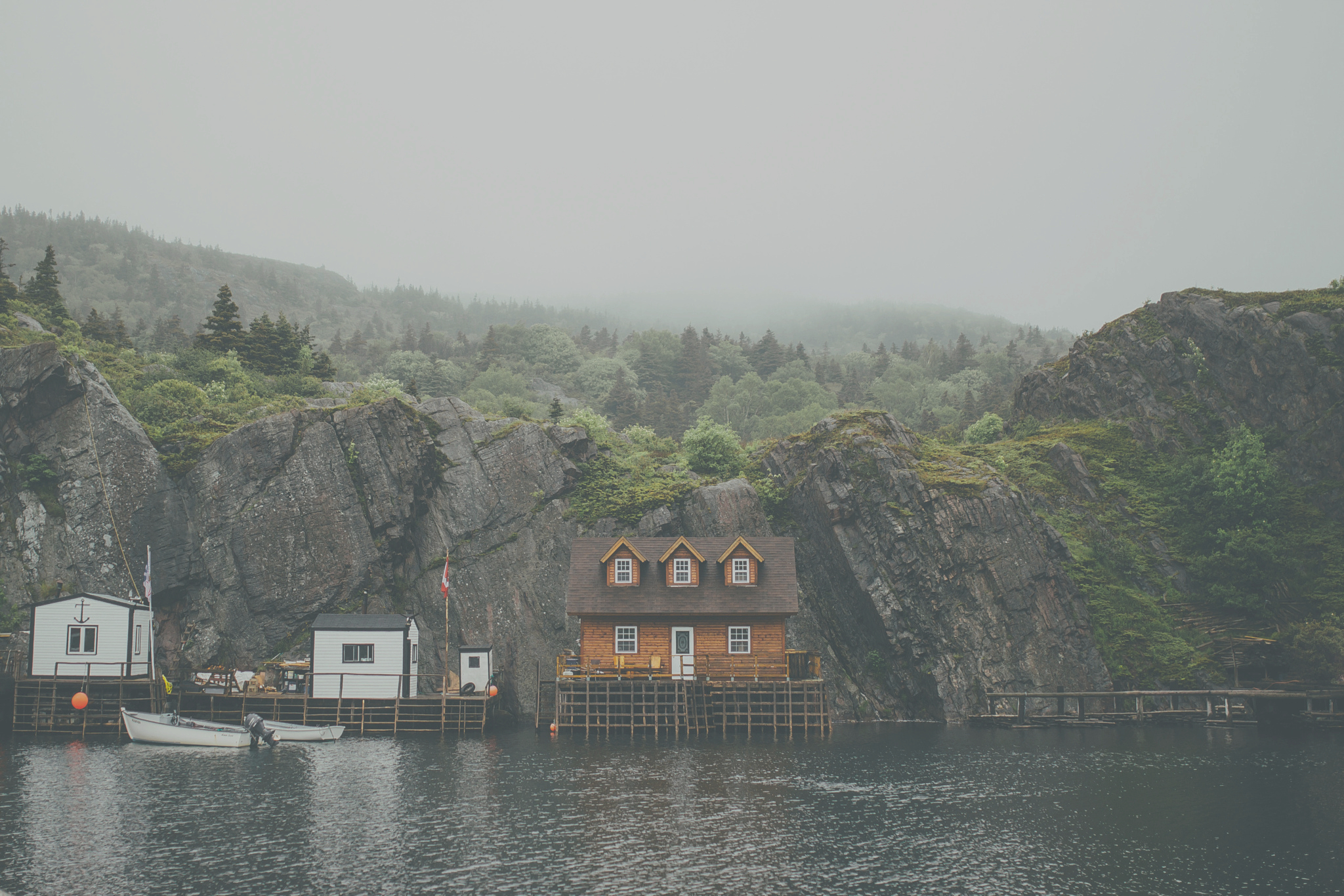
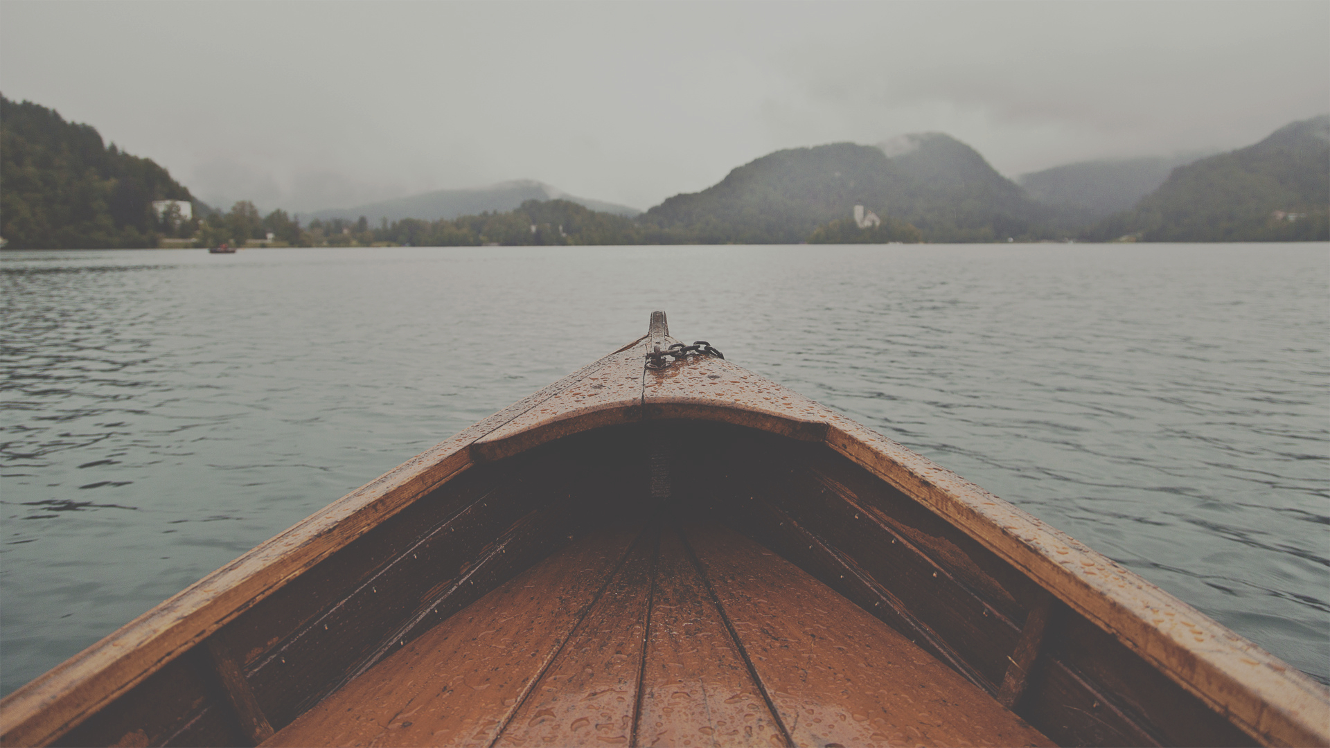
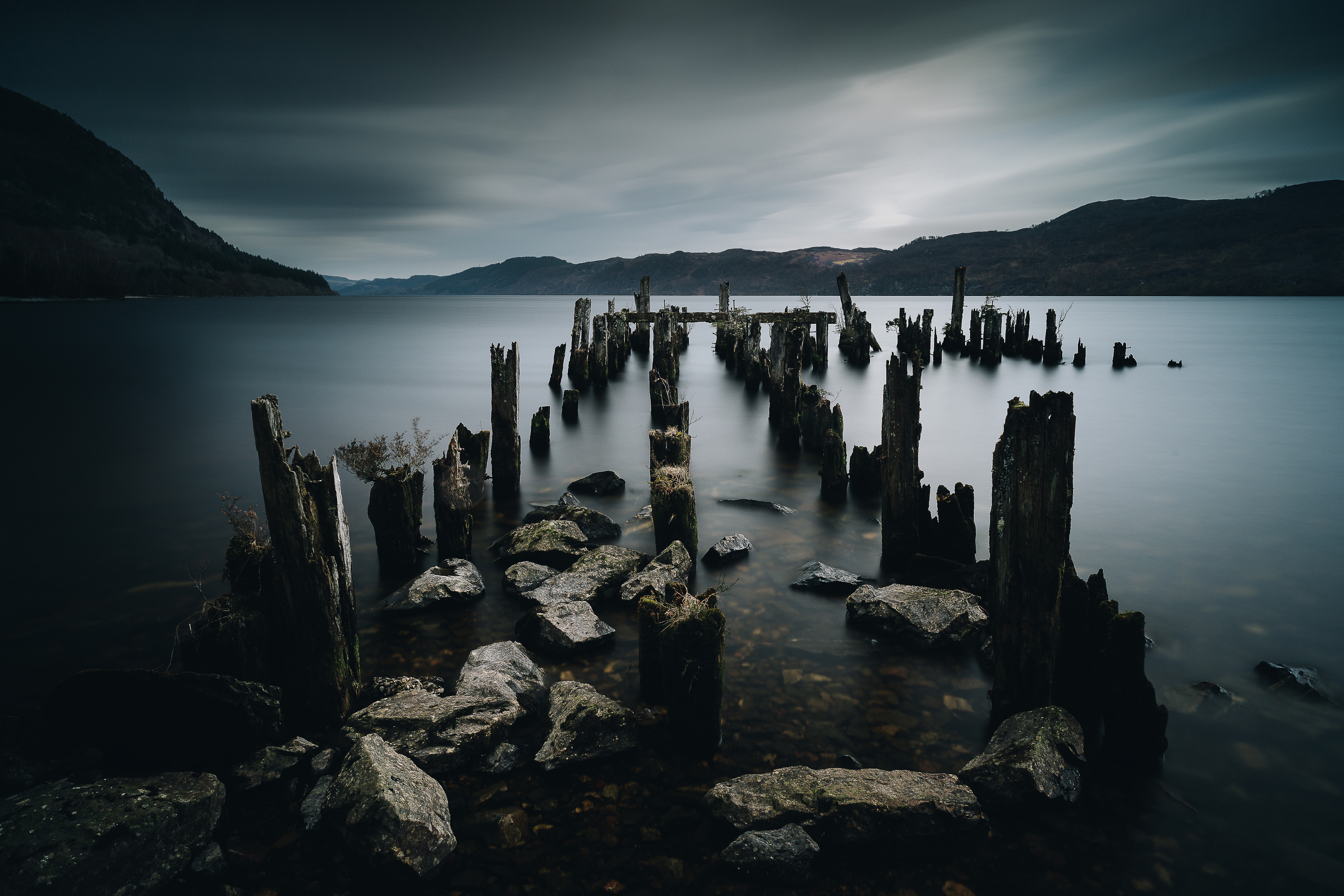
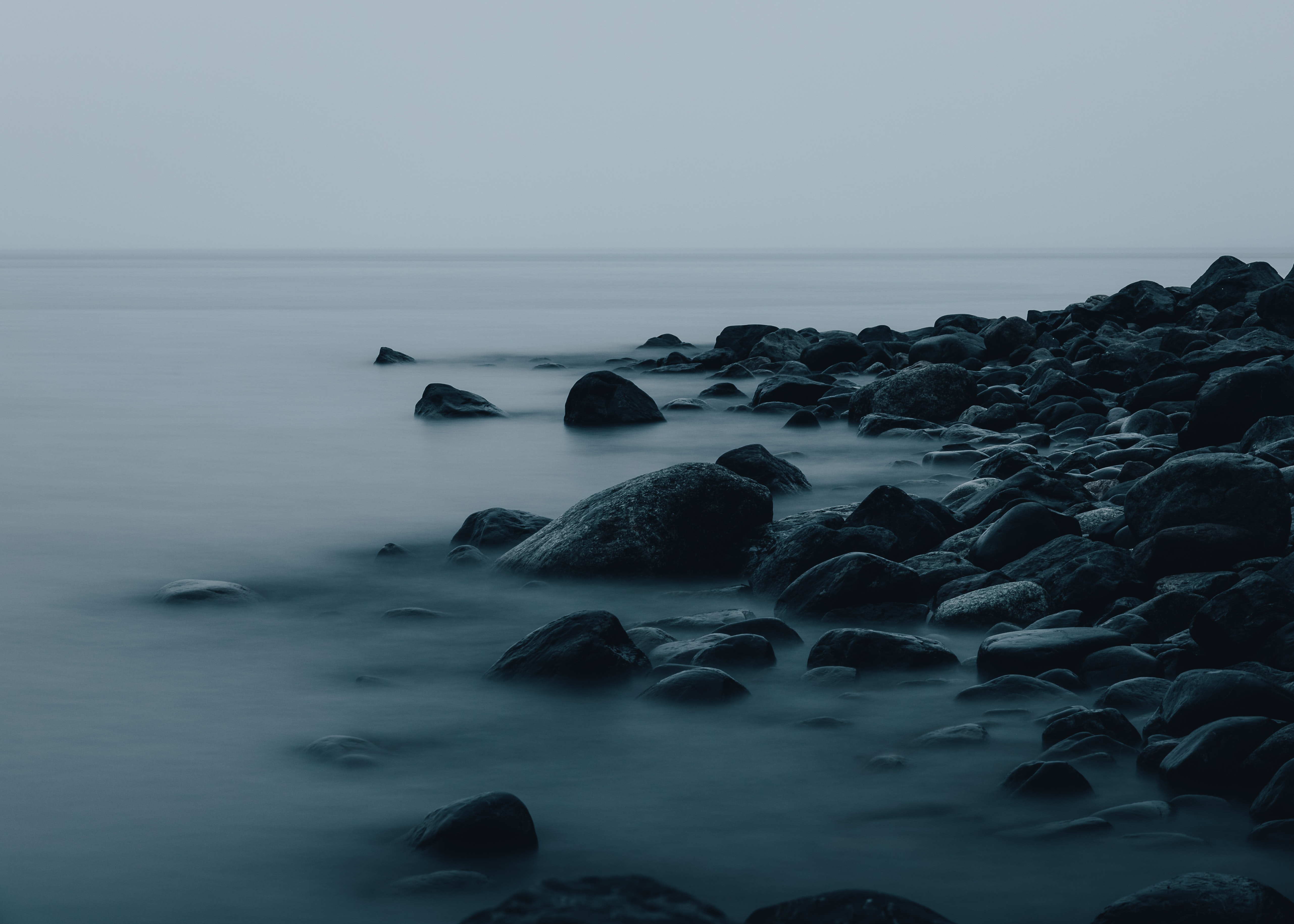
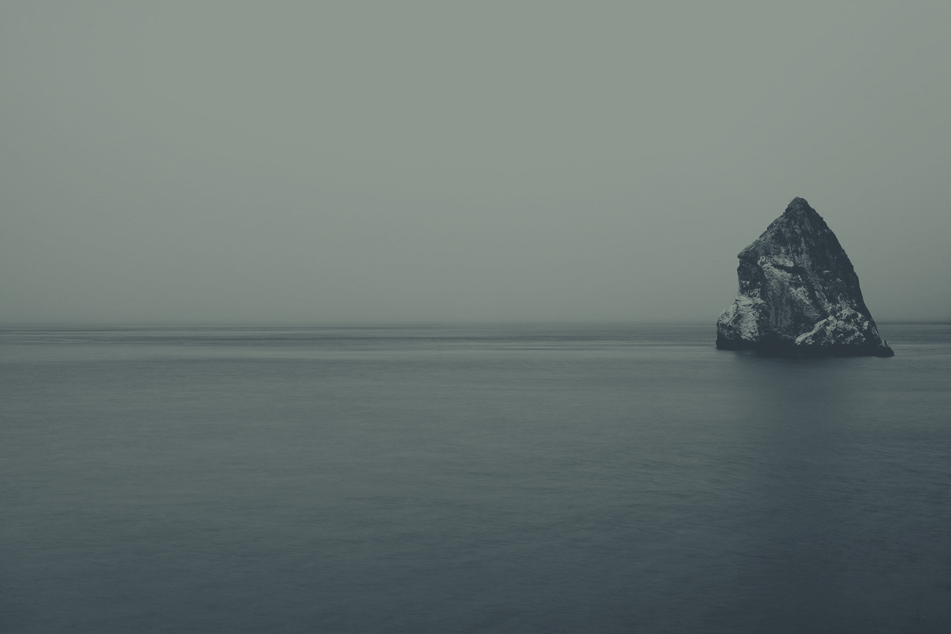
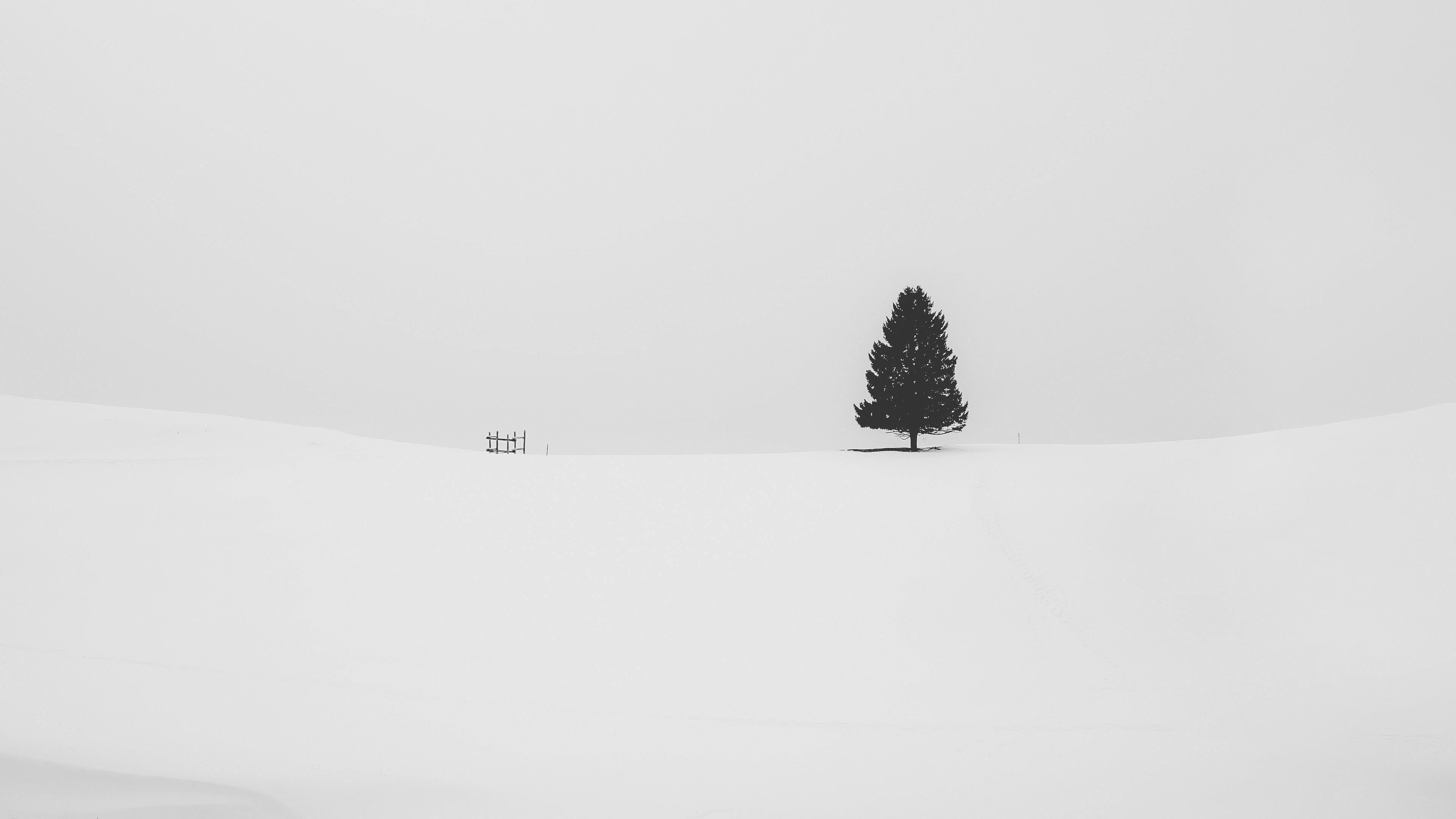
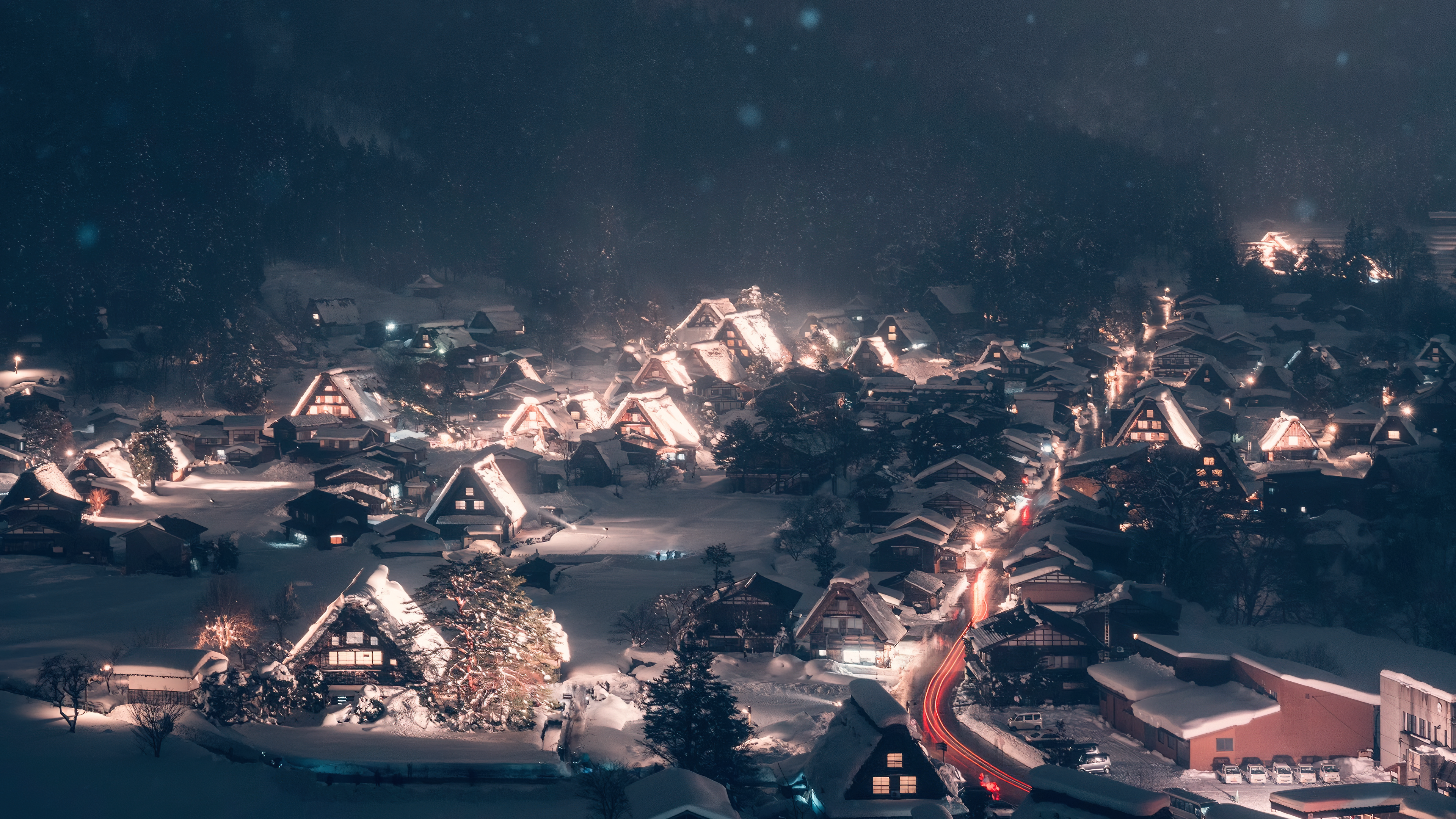
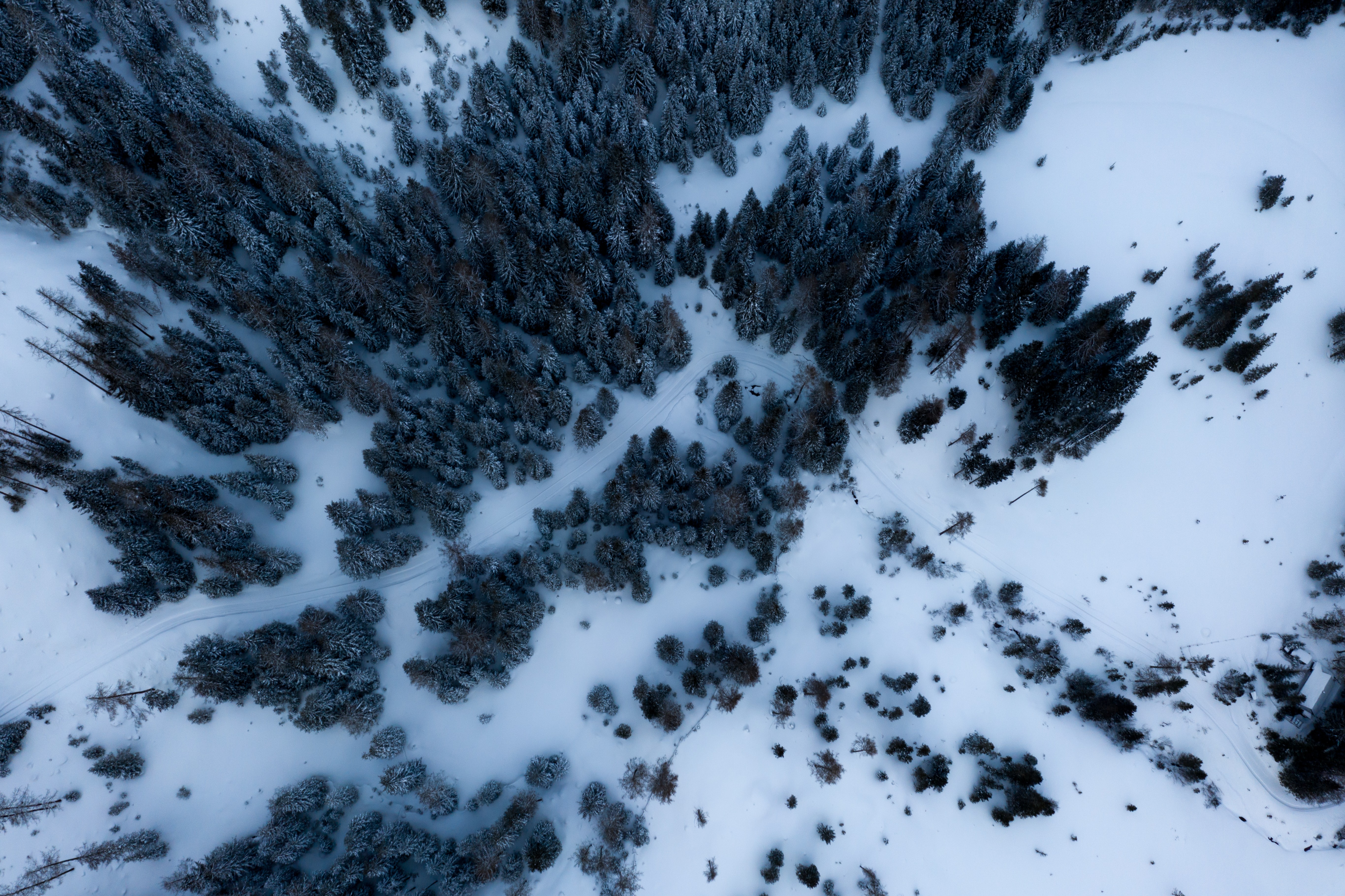
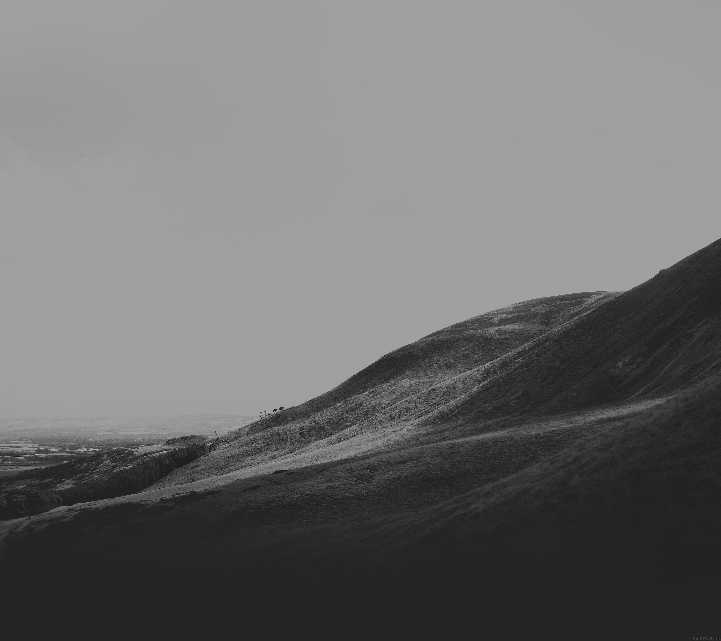
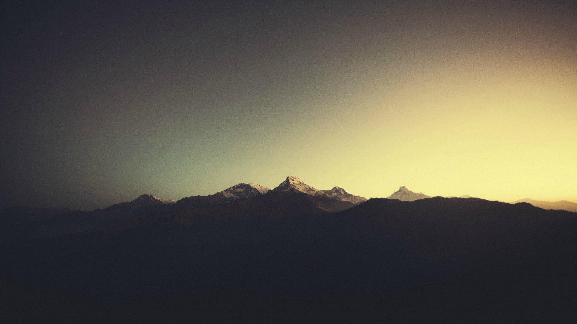
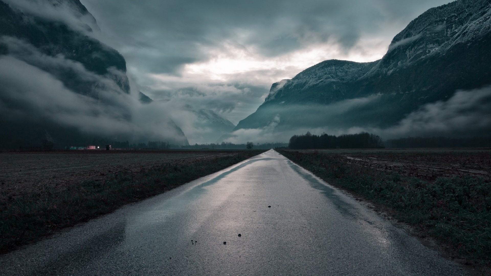
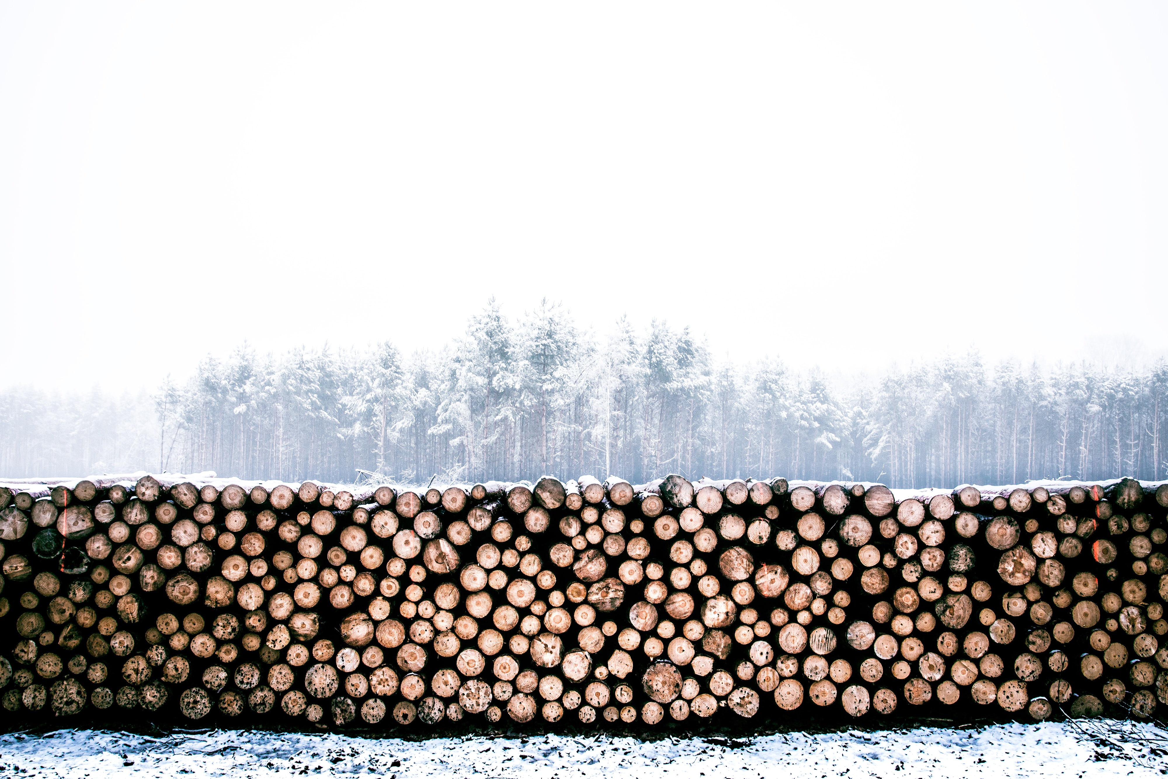
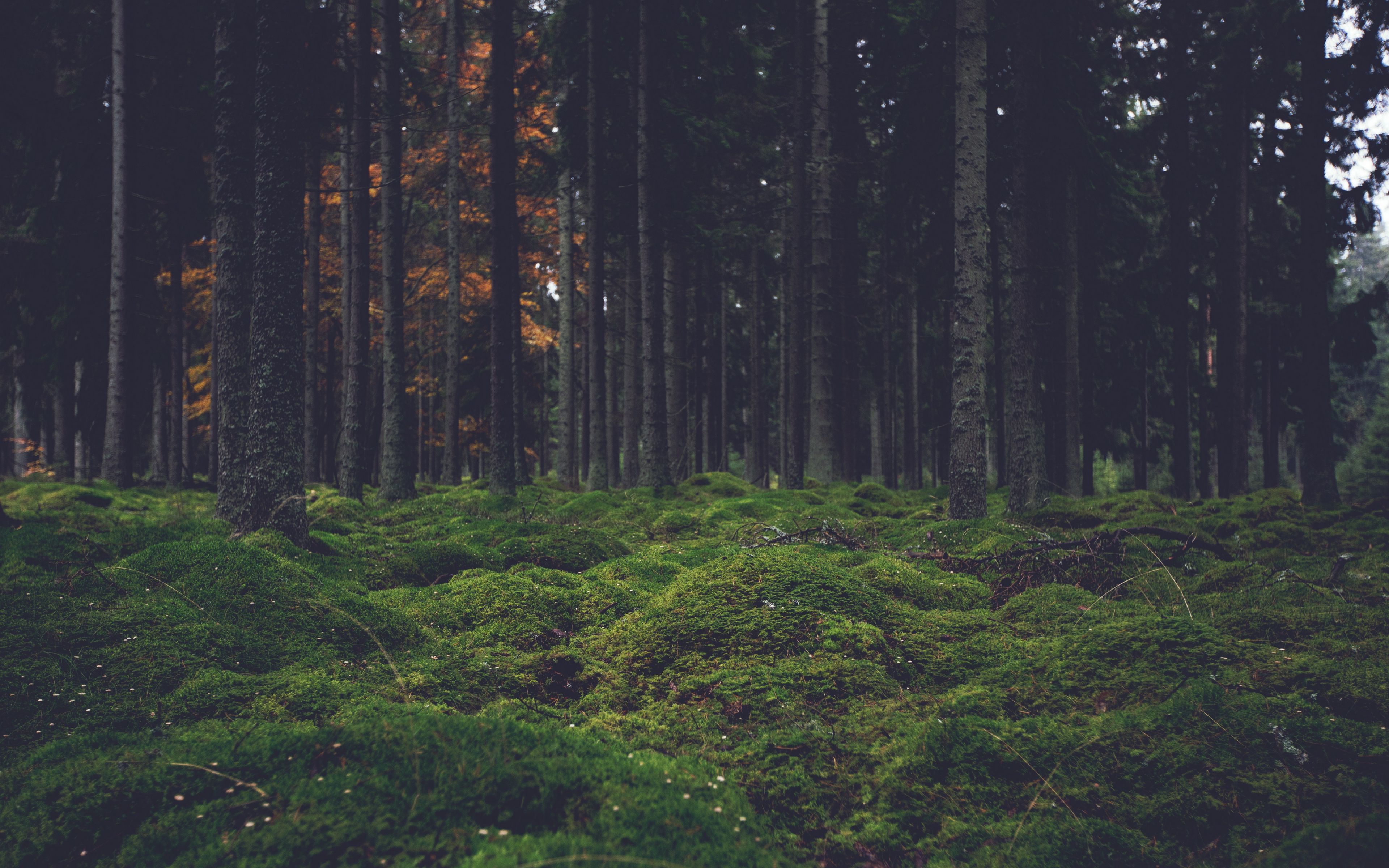
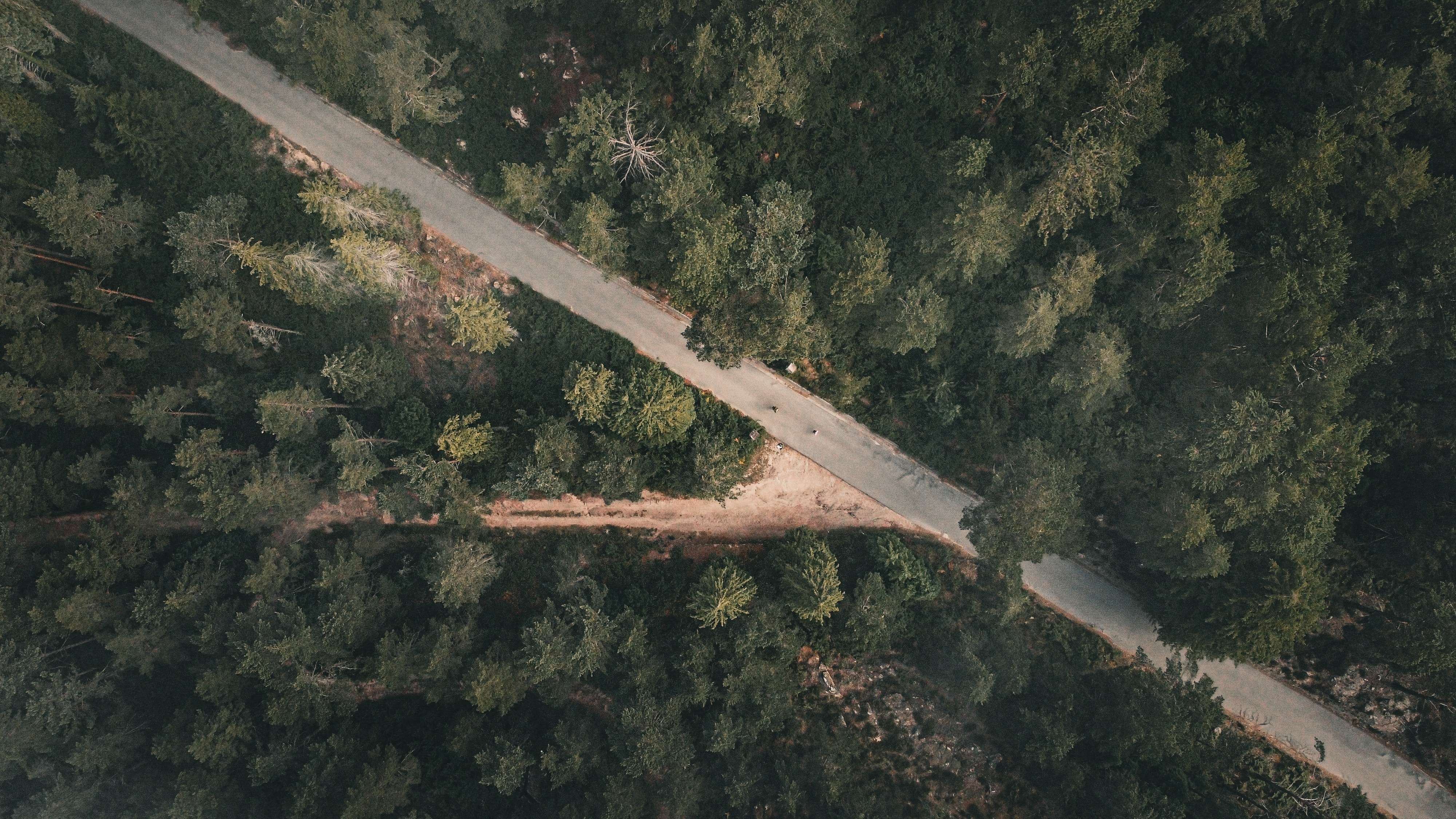
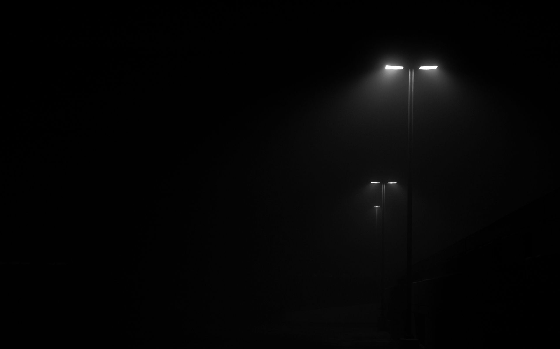
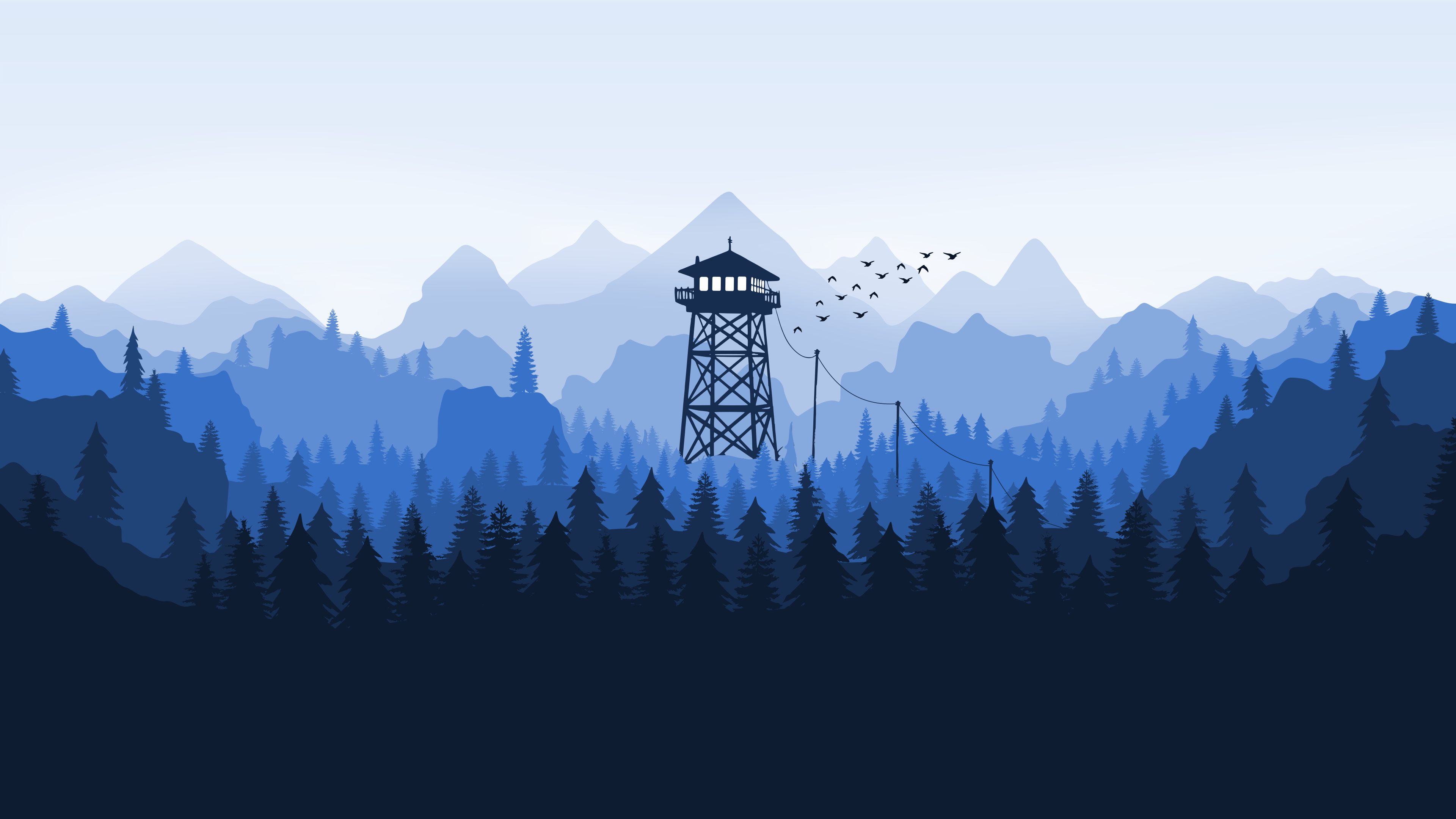
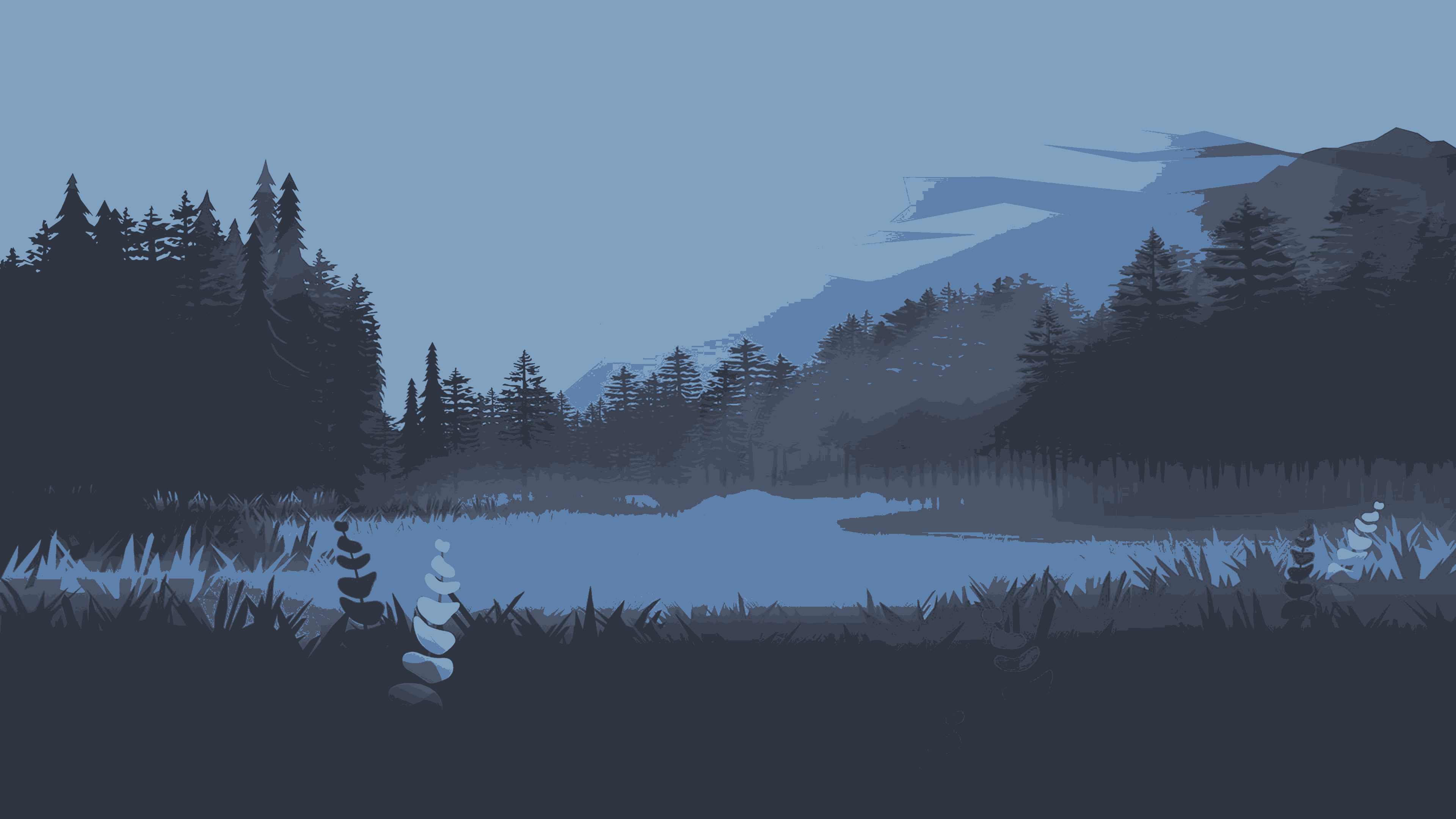
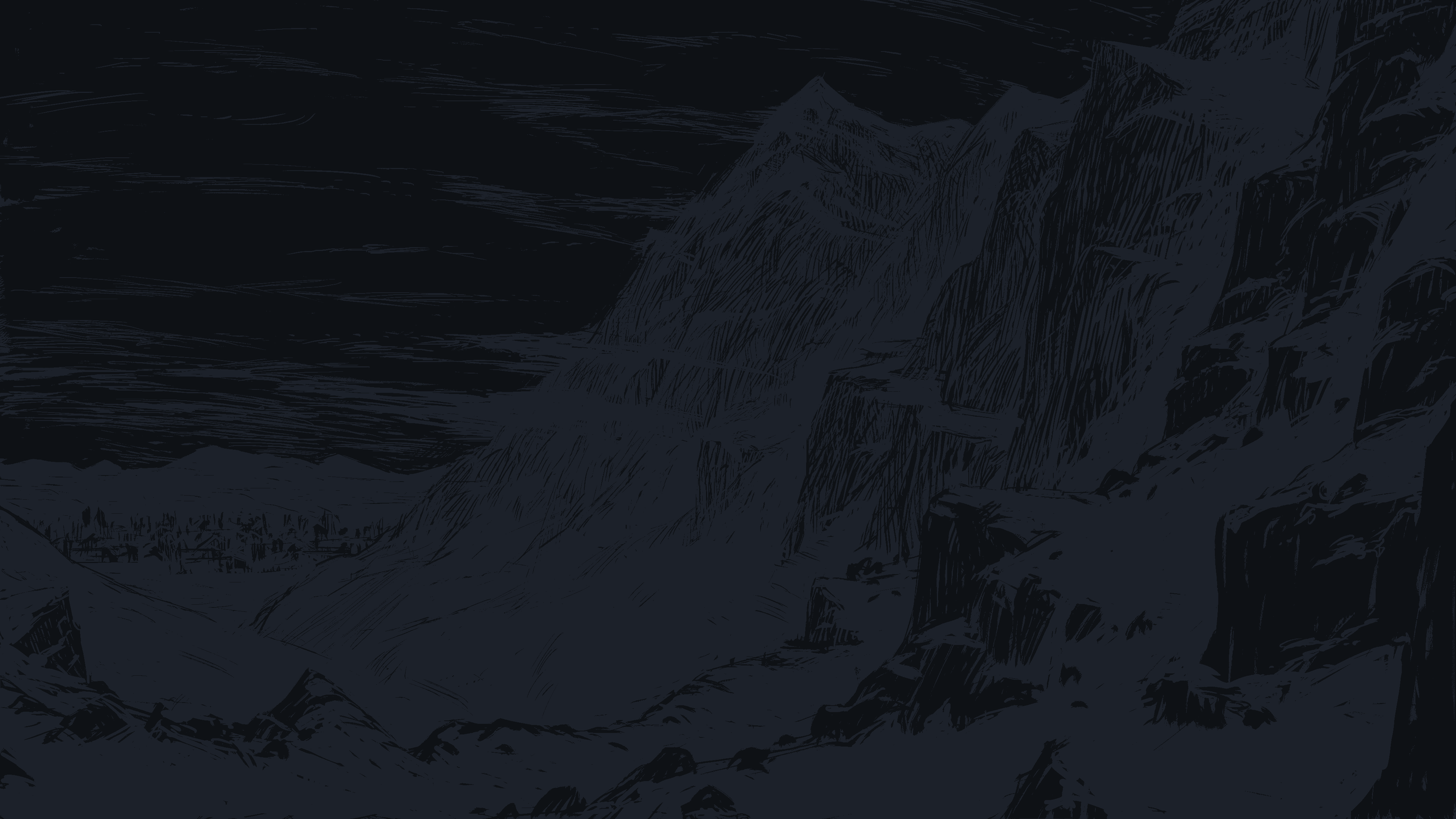
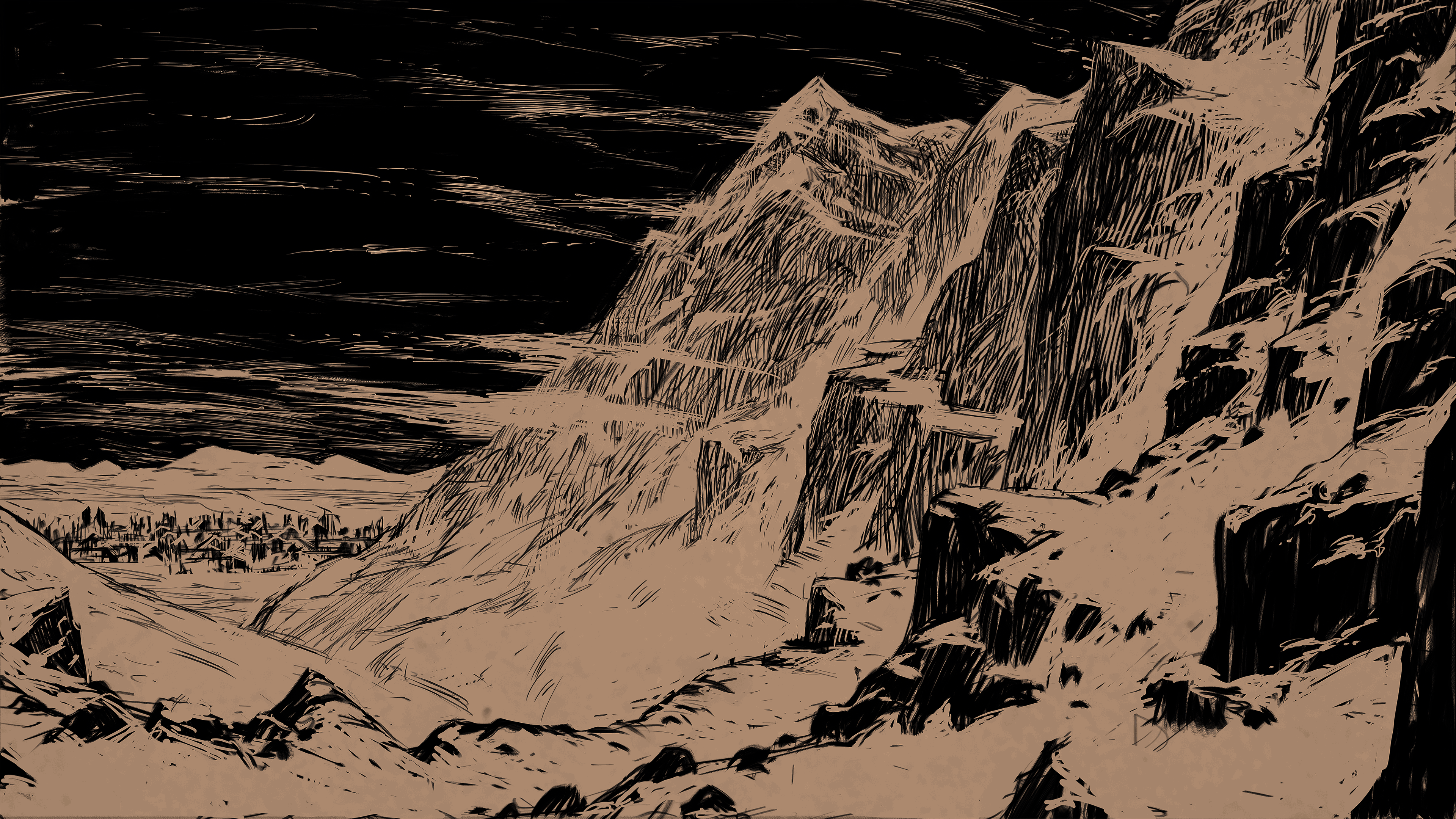
mood & atmosphere
Dark, quiet, Nordic. Functional like a terminal, atmospheric like a foggy forest. It does not perform, it does not shout.
principles
do & don't
image library
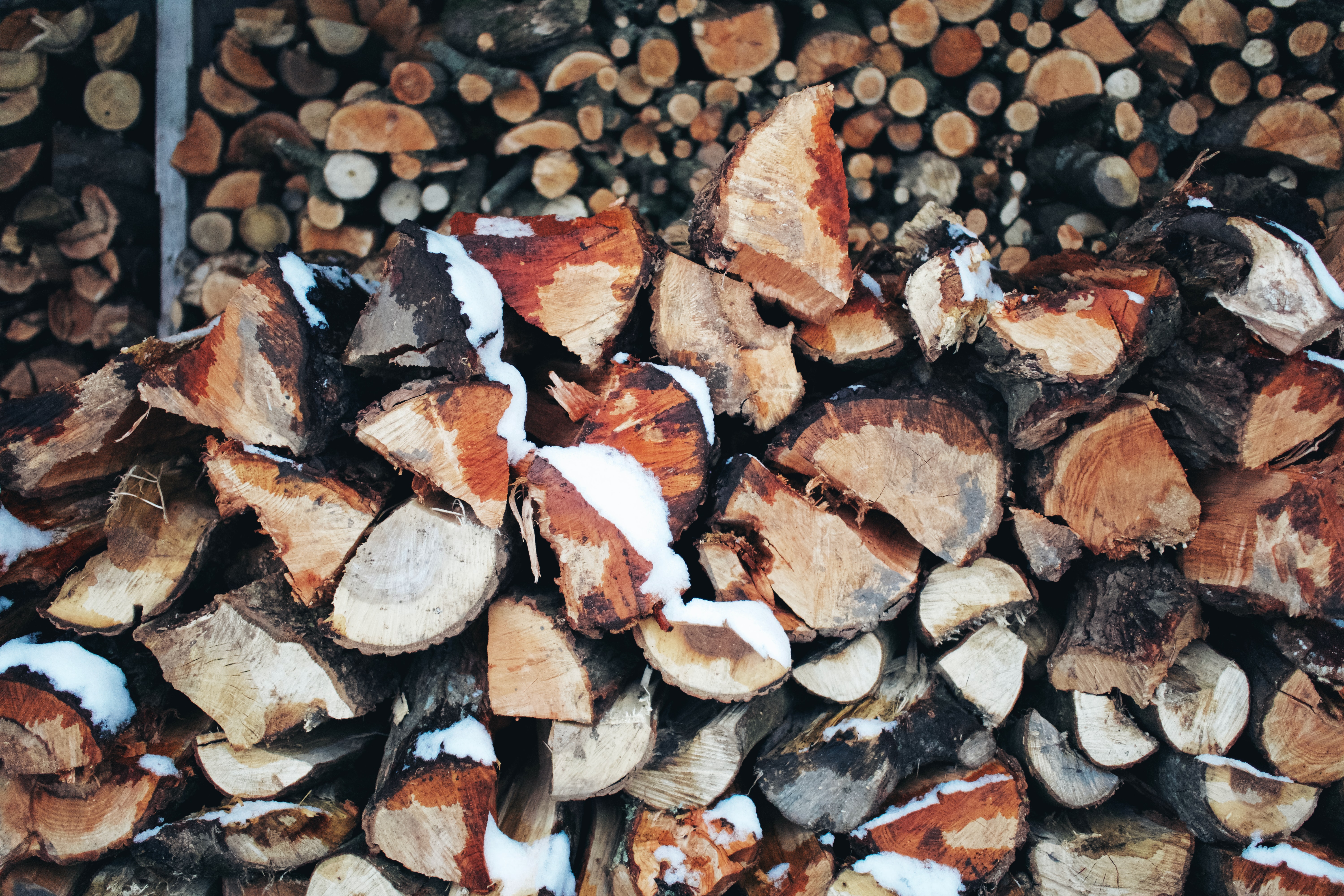
24 curated images. Used for page backgrounds, logo backdrops, section headers, and crop details. Prefer photography for full-bleed backgrounds.
for claude
When building UI for leik.dev projects, apply these rules without needing to be asked.